In this notebook, we will define and visualize the grid that will be used for the California current model.
First, import packages to create and visualize the model grid here:
[1]:
# import the modules for computations and plotting
import numpy as np
import matplotlib.pyplot as plt
import cartopy
import cartopy.crs as ccrs

# import the distance function from eccoseas
from eccoseas.toolbox import distance as etd
3.2.1. Constructing the Grid
The grid for this model will be located on the west coast of California covering 135-115\(^{\circ}\)W in longitude and 29-52\(^{\circ}\)N in latitude. The grid spacing will be \(1/12^{\circ}\) in the zonal (east-west) direction and \(1/16^{\circ}\) in the meridional (north-south) direction, covering a grid of 360 rows and 240 columns.
This grid can be created in Python as follows:
[2]:
# define the parameters that will be used in the data file
delX = 1/12
delY = 1/16
xgOrigin = -135
ygOrigin = 29
n_rows = 360
n_cols = 240

# recreate the grids that will be used in the model
xc = np.arange(xgOrigin+delX/2, xgOrigin+n_cols*delX+delX/2, delX)
yc = np.arange(ygOrigin+delY/2, ygOrigin+n_rows*delY+delY/2, delY)
XC, YC = np.meshgrid(xc, yc)
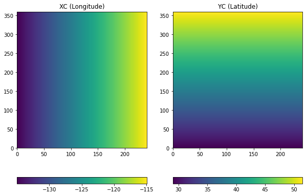
3.2.1.1. Visualizing the Grid
The grids above can be visualized as follows:
[3]:
# make a plot of XC and YC
plt.figure(figsize=(10,7))

plt.subplot(1,2,1)
C = plt.pcolormesh(XC)
plt.colorbar(C, orientation = 'horizontal')
plt.title('XC (Longitude)')

plt.subplot(1,2,2)
C = plt.pcolormesh(YC)
plt.colorbar(C, orientation = 'horizontal')
plt.title('YC (Latitude)')

plt.show()
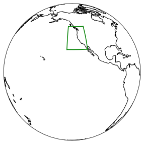
3.2.1.2. Visualizing the Grid on a Map with Cartopy
To get a sense of where the model is located on the globe, cartopy can be be used to plot the domain on the globe:
[4]:
plt.figure(figsize=(5,5))
ax = plt.axes(projection=ccrs.Orthographic(-130,10))
ax.plot(XC[:,0], YC[:,0], 'g-', transform=ccrs.PlateCarree())
ax.plot(XC[:,-1], YC[:,-1], 'g-', transform=ccrs.PlateCarree())
ax.plot(XC[0,:], YC[0,:], 'g-', transform=ccrs.PlateCarree())
ax.plot(XC[-1,:], YC[-1,:], 'g-', transform=ccrs.PlateCarree())
ax.coastlines()
ax.set_global()
plt.show()
3.2.1.3. Visualizing the Grid Spacing
The model grid is defined in terms of units in longitude and latitude although it is useful to quantify the grid spacing in terms of more familiar units, such as meters. The great_circle_distance function from eccoseas can be used to quantify this distance. Loop through the points to generate inter-point distances in the horizontal (dXC) and vertical (dYC) directions:
[5]:
dXC = np.zeros((np.shape(XC)[0], np.shape(XC)[1]-1))
for row in range(np.shape(XC)[0]):
    for col in range(np.shape(XC)[1]-1):
        dXC[row,col] = etd.great_circle_distance(XC[row,col], YC[row,col], XC[row,col+1], YC[row,col+1])

dYC = np.zeros((np.shape(YC)[0]-1, np.shape(YC)[1]))
for row in range(np.shape(XC)[0]-1):
    for col in range(np.shape(XC)[1]):
        dYC[row,col] = etd.great_circle_distance(XC[row,col], YC[row,col], XC[row+1,col], YC[row+1,col])
Finally, make a plot of the inter-point distances:
[6]:
# make a plot of XC and YC
plt.figure(figsize=(10,5))

plt.subplot(1,2,1)
C = plt.pcolormesh(dXC)
plt.colorbar(C, orientation = 'horizontal')
plt.title('dXC')

plt.subplot(1,2,2)
C = plt.pcolormesh(dYC.round(3))
plt.colorbar(C, orientation = 'horizontal')
plt.title('YC')

plt.show()
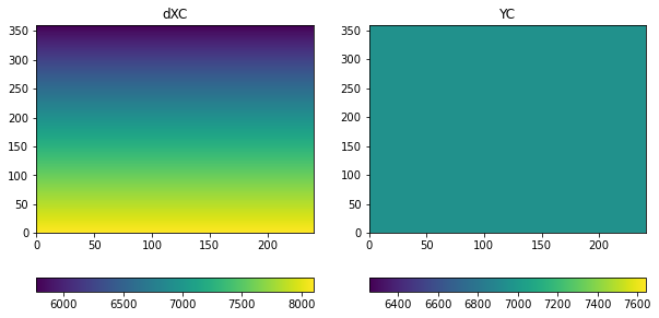
As we can see the grid has a resolution of about 7 km, although there is a north-south gradient in horizontal distances (in other words, points further north are closer together).